Star Trek: Deep Space Nine hit the airwaves in January of 1993 with a two-part premiere episode entitled “Emissary.” The series would go on to run for seven seasons — wrapping with the critically acclaimed final episode “What You Leave Behind” in June of 1999.
The well-known title sequence of the show — depicting an asteroid traveling through space as it passes by the space station and the appearance of the gold and silver DS9 logo. The logo, which utilized a new typographic treatment for the Star Trek logo appeared much different than it had during The Original Series, The Next Generation and (at that point) six feature films.
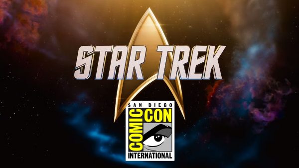
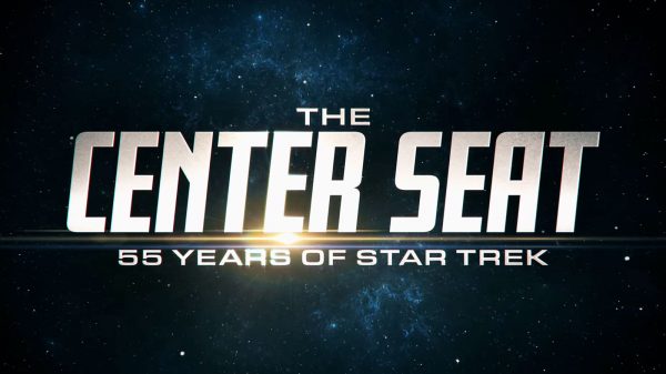
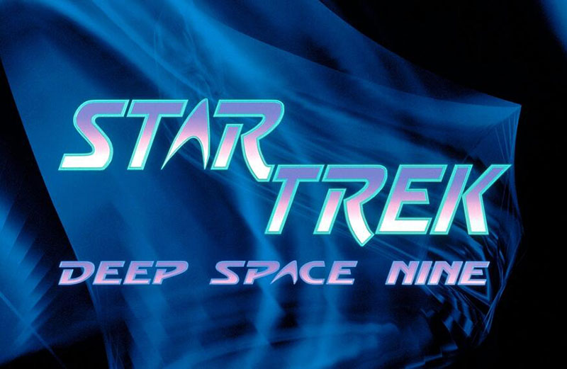
In 1992, prior to the series’ premier, a much different Deep Space Nine logo was used in commercials and printed material before the final version was finalized.
Check out the logo that could have been, below.
What do think about the original DS9 logo? Tell us in the comments below.
via Trekcore


























adamofmars
December 31, 2014 at 11:07 pm
the original logo makes sense for what it was – a teaser. it looks very similar to the TNG logo but with extra effects. what really surprises me is how similar the final DS9 logo is to the logo used the movies featuring the original series cast members. Voyagers looks similar too. TNG’s logo is the only one that looks drastically different from the others.
ENK
March 5, 2015 at 10:59 pm
It wouldn’t have been as timeless as it is now… too… ’90’s graphic designer acid trip!
Eric Cheung
March 1, 2016 at 4:16 pm
I remember this when I first saw anything from the show at all, it was at a convention 10/03/1992 in Boston.
Krazy Joe
May 20, 2016 at 9:33 am
“The well-known title sequence of the show… the appearance of the gold and silver DS9 logo. The logo, which utilized a new typographic treatment for the Star Trek logo appeared much different than it had during The Original Series, The Next Generation and (at that point) six feature films.”
This is INCORRECT!!! THe DS9 logo used on the show was the same font used for Star Trek: The Motion Picture and the first five sequels up through ‘Undiscovered Country’. Deep Space Nine DID NOT utilize a new typographic treatment….it used the one from the first six movies.
I like the teaser logo much better. It was unique. It would have been nice for DS9 to get it’s own unique logo rather than a hand me down logo from the movies.