It was a memorable day for Star Trek fans who were fortunate enough to attend the Star Trek: Discovery production panel at Fan Expo Canada in Toronto last Saturday (September 3). The panel was the first of its kind ever to precede a new Star Trek series offering exclusive insights into the design of the series from new concept illustrations, digital models, digital animations to photographs of sets and props.
Unfortunately, photos and video were not permitted during portions of the panel.
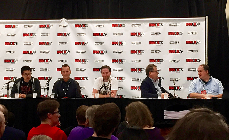
Star Trek: Discovery production panel. From left to right: Andy Sang, Matt Middleton, Matt Morgan, Mark Steel, Tim Peel
The panel was headed by Art Director and Lead Set Designer of all things Klingon Matt Middleton who was joined by Mark Steel – Supervising Art Director, Matt Morgan – Lead Set Designer Federation, Tim Peel – Lead Graphics Designer, Andy Sang – Graphics Designer, and from L.A. through live video feed, Todd Cherniawsky – Lead Production Designer who along with Mark Worthington head the production of Discovery.
Matt Middleton opened the panel with some inspirational words to reaffirm their dedication and commitment to this project:
We want to keep Gene Roddenberry’s initial intent alive which is to find a place where we can celebrate the diversity of humanity and our ability to work together as a species to boldly go. We are all at our core Star Trek fans,
Production Designer Todd Cherniawsky kicked off the panel by addressing the commitment of the creative team and their dedication to the legacy of Star Trek, saying:
It’s sometimes very easy for the fanbase to be very critical and fairly critical of the work we do. But the one thing I want to enforce to this audience and the entire Star Trek audience is that for all of us here that had a chance to work on the show, this is very very precious material to us.
This has all informed our childhood, we’ve all been fans. So every decision that has been made along the way has been really carefully thought out. But we also do appreciate criticism out of concerns for the franchise.
You’re kind of a privileged group of people right now to be in this room, and you have to review that and take that to heart. Leaks very, very much hurt the show, so take this as a special occasion for you to be a select group of people to see stuff that other people may not ever get a chance to see.
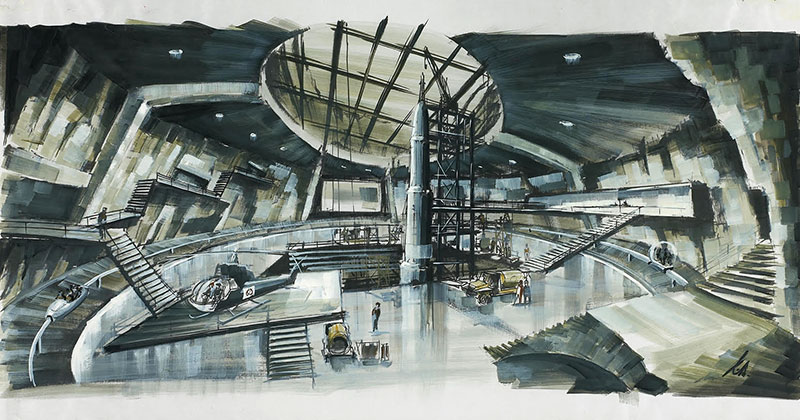
When Mark Worthington and I first began on the show we both were children of the 60s. We grew up as very young children when the TV series was out. At the time I was very influenced by the James Bond films because for me in the late 60s and early 70s that was what the future was gonna look like. So the work of Ken Adam and Peter Lamont was very influential. Starting with those forms that would dissipate through the Star Trek universe because it seemed to make sense to still be as true to TOS as possible. That series was envisioned in the 60s so Mark and I asked the team if we could take that as a point of reference, is what would the future look like in the 60s and 70s hundreds of year in advance but still, of course, utilizing all the great tools we have today.
I know there’s been a lot of discussion about our ships already but please note, that John Eaves and Scott Schneider are our principal Federation ship designers. John Eaves has probably designed 70% of all Star Trek television series fleet. So John knows these ships better than all us do. So he did not have a hard launch, he was always working under Bryan Fuller’s overall vision of where the series should go. We’re obviously trying to update these things. Fabrication process has changed so much since the 60’s so we have to take those things into account.
We are always asked how accurate the exterior of our ships reflect the interior. We go to great lengths to make sure the rooms fit inside the house. We obviously have to take cheats at times — one of the great classic examples is that you cannot fit the interior of the Millennium Falcon in the exterior of the Millennium Falcon! So there are times when we have to take artistic license, it’s still most importantly about the story. Reality and science are our spring points, but remember, it is science fiction.
Getting the chance to revisit the shuttle and turn it into a much more robust and a much more shootable and usable space for storytelling was another real highlight for our team.
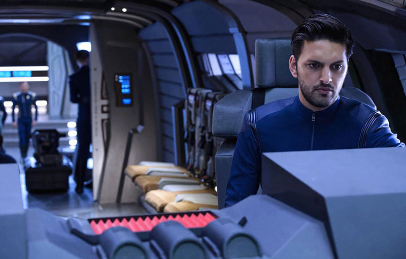
Shazad Latif as Lt. Tyler on Star Trek: Discovery
Rome was not designed by one architect, a contemporary city is not designed by one urban planner, even a vehicle is designed by multiple people and I think that’s what makes these worlds so rich is that there are so many people and so many perspectives and ideas.
Supervising Art Director Mark Steel then took over the microphone and shared his insights into the physical scope of the production with regards to stage sizes and what a massive undertaking this show is.
I thought it would be kind of fun to show a little bit of perspective on Star Trek as a television show.
Mark Steel proceeded to show original series stage 9 at Desilu in 1966 and compared it to the current stages at Pine Wood studios, specifically where the USS Discovery sets are. The difference in size induced a collective “WOW” from the audience. The square footage that Star Trek Discovery is utilizing is no joke, its massive, at least four times the size of the Desilu Enterprise stage.
I’m not going to try and go into the details and the challenges that art departments for the last 50 years would have had doing this show. A lot of the fundamental issues of bringing a creative vision from writers, directors production designers into the practical world of making a TV series on schedule are more or less the same as they were 50 years ago. But the big difference, the big standout in terms are where we are now from then is we’re entering what is the – you’ve all heard the new golden age of television – where we potentially have a kind of episodic cinema that is being produced now and that brings with it a scale and challenge that basically pushes our design process into the realm of feature film. Our sets in terms of detail and facility are on par with major motion pictures now.
There are six stages in action right now, it’s an ongoing organic landscape for the show.
My job, along with Matt Middletown, is to assemble a team of people to try to meet the demand of this scale. What that means, is that in our modern television production with myself and Todd, there are 7 art directors, more than 9 illustrators, more than 35 set designers, and more than 450 painters, carpenters, sculptors, model makers, welders, set dressers, prop builders — in shops in Toronto, Montreal, Calgary, and Los Angeles — all working together to bring us this volume of scenery to make the show.
One of the things we strive for is scale. Because of our modern cinematic approach, you’ll notice that the old Desi stage followed some of the basic principals of television in that everything is interchange and you can switch things around, which we do to but what we’ve done is we’ve scaled up so that the crew and the cast are actually in the sets now, you’re on the ship it’s more like a location than it is an actual stage. Which you’ll see if you watch the show, it’s a far more immersive environment now. And I have to say for me it’s like a personal career highlight to guard this into the next chapter of this franchise.
Art Director Matt Middleton then took over the conversation specifically discussing Klingons and their sarcophagus ship as he – in his own words – is the “Lead designer for all things Klingon.”
I just want to make a quick note, you’ll notice up here at the table it’s all men, and that is absolutely not representative of our art department. It is very close to 50/50.
Early in the pre-production phase fans will have noticed that some early concept art was leaked out (speaking of the Klingon ship designs) and it started the initial response of those who are very excited about this show and talking about what they did and didn’t like, as will always happen.
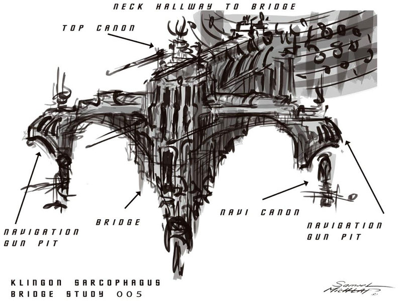
Matt showed an early schematic concept of how the Klingon sarcophagus ship bridge might be structured.
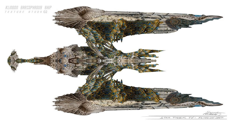
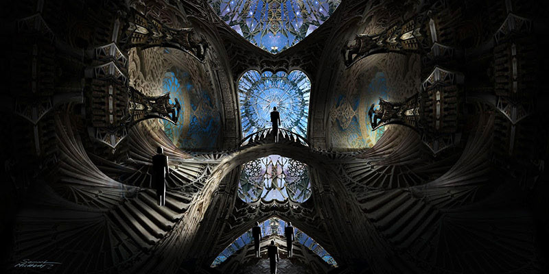
We all know Klingons have birds of prey and starting with that, things being organic and technological advanced but organic in nature was certainly a defining influence. There were certain staging requirements for the actual ship that needed to have a cathedral type presence and be both a church, a ritual space and a functioning bridge for the Klingon empire. You can see some of the board gestural aspects of creating a multi leveled cathedral type space, unlike anything you’ve seen before as was Bryan Fuller’s mandate.
So, the sources that he and the design team went to were feudal sources so going back to Byzantine, and Medieval Gothic and Islamic sources to find references that would create a high level of sophisticated detail for a race that had long been perceived as brutal, one minded and simplistic. In order to breathe new life into the Klingon race and raise them to the noble status and worth adversarial position that this new iteration of the series would demand.
Multiple levels, mezzanines, focal points for a dramatic staging of our Klingon leaders and creating dramatic spaces where power plays and shift of power could occur. And also giving unparalleled views into the broader space so that we felt the space when we’re in the ship. You don’t find yourself in a room like this where there are no windows and you just interacting with space on the view screen. Bryan Fuller always wanted to maximize how much we feel the presence of space in our position within.
It’s very large ship, massive, this bridge only encompasses a very small section of it. Just the point of the head; the set itself is 40 feet tall and a 100 feet long and about 50 feet wide. It has cantilevers and lots of stairs, railings.
Refereeing to T’Kuvma’s ship its a “vast sarcophagus ship which becomes a flag ship of sorts for the Klingons.”
We also sought not just the have fine looking architecture but also details that spoke to the history and the culture of the Klingon race and as a touchstone we look to the Star Trek novel The Final Reflection by John M. Ford which was a work that was used as a launching off point thematically for the Klingons by Bryan Fuller.
Here’s the podium, we can see there’s Klingon text on the steps. And we have elaborate ritual torches and sarcophagi, and glyphs, and other details. For example, the Klingon text on the plinth was all carefully researched and taken transcriptions from John’s the final reflection and we made sure that we had accurate Klingon translation.
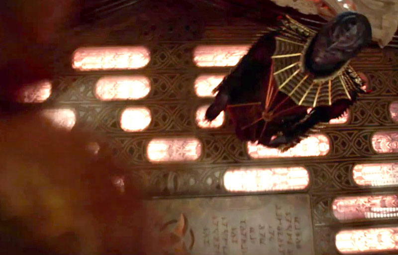
Chris Obi as T’Kuvma on Star Trek: Discovery
The plinth Matt speaks is the large stone slab underneath the sarcophagus from the trailer of it as it rises in front of T’Kuvma.
Here is the translation “I will go now to Sto’Vo’Kor but I promise one day I will return then Kahless pointed to a star in the sky and said looks for me there on that point of light” which is the prophecy from Kayless. We always sought to ingrain these details into the actual set and as we proceed this adherence to detail and reverence for all things Klingon pervaded our art department and we had much delight taking on the roles of the Klingons and thinking how would their space be and how can we pay them the most honor. This guided us to details like the game of Klin zha which we created from the book The Final Reflection and is a game warlords play against each other to teach military strategy…..and blood wine cups which have Klingon text on them in this case “may your blood scream.”
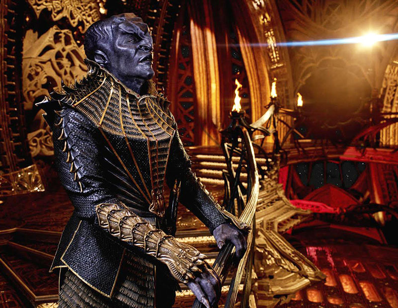
Matt then shows images of the finished sarcophagus bridge set to huge applause from the audience. To say the Klingon sarcophagus ship bridge is detailed is a gross understatement. Its design and detail is unlike anything we have ever seen in Star Trek before and that includes the Star Trek movies. We’ve all seen how detailed the Klingon bridge floor is in the trailer as the sarcophagus ship rises, that is only a small taste. The shapes, patterns, carvings, images, colors all culminate to such an intricate level of detail that there are no words to justly describe it, you have to see it to believe it.
You’ll notice – if you look at it and think back to that earlier image of the gothic illustration – it had sort of a perplexing quality of an Escher maze where you can’t quite see where things connect to others and we sought to capture that and to keep that essence and it feels like the amount of effort we put into it allowed us to retain that essential quality of being unlike anything you’ve ever seen before and highly detailed and ornate and speaking to a culture that is exceeding advanced and an elegant backdrop to a very thematic story. And provides breathtaking views for the staging of strong scenes and interplay of power dynamics and allow us for some swashbuckling action to take place as you go from one level to the next and work your way up and down that set.
Lead Set designer Matt Morgan has been helming all things Federation from the Shenzhou to the Discovery and other Federation interiors like Starfleet Command. He showed images of the Shenzhou and Discovery bridge concepts as well as the actual set. A plan showing the Shenzhou bridge and the captain’s ready room.
One of the most-unique things about this bridge is that its underslung on the bottom of the hull which presented some challenges for construction in that it’s built 12 feet off the ground. It’s a challenge for the crew to work in, to build and its massive set.
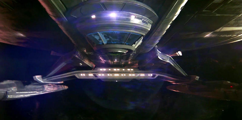
Morgan showed some photos and sketches of the Shenzhou bridge. Most notably was the plaque on the bridge. I wasn’t able to see where the Shenzhou was built but the phrase on the plaque was “All existing things are really one” which is from the Zhuangzi which is an ancient Chinese containing stories and anecdotes that exemplify the carefree nature of the ideal Daoist sage.
One of the main things for almost all our sets is they all have integrated lighting, more than you can imagine.
To elaborate his point on integrated lighting he showed images of corridors and the turbolift.
As there are two main Federation ships for this series, one of the main things is how can we use these sets for two ships. There’s the Shenzhou corridor and by switching certain elements, graphics, paint (it can be used) as the Discovery corridor.
As Morgan was discussing using the same sets for two ships, he showed images of both the Shenzhou and Discovery corridors which are one in the same but had slightly different lighting, wall panels, color schemes and graphic elements. The Shenzhou corridor was a more reddish/maroon color scheme whereas the Discovery had colors more akin to amber and yellow.
For every one of these sets there’s probably thirty to hundreds of pages of drawings of different details breaking things down into parts for CNC.
He showed an image of the TOS sick back from Journey to Babel with Spock and Sarek on the operating tables with Dr. McCoy and Nurse Chapel standing next to them.
For our sick bay we drew inspiration from the TOS sickbay.
He then shows an image of the Discovery sick bay which was very impressive.
As Mark showed in the stages, we have a lot of sets packed into certain stages so to build these things everything has to be built to be very modular, to be broken down and assemble on stage as quickly as possible. Early concept of the Shenzhou transporter, the other challenges with the set is to try and design things in a way that we could repurpose and go back and forth between different things.
We were then shown unseen images of the Shenzhou transporter room. One was from the entrance so we had a full view of the horseshoe shaped transporter platform surrounding the controls in the center. The Shenzhou transporter room had far more individual platforms that the tradition six we have always seen in most transporter room including USS Discovery. Granted he was flipping through the images fairly fast but I counted 8-9 individual pads on the platform.
Morgan said:
The Discovery transporter is in the exact same space as the Shenzhou transporter room and allows us to go back and forth between the sets. [Same with] the Shenzhou and Discovery turbolift set.
Middleton added:
Now I’m just going to mention, he [Matt Morgan] mentioned that lighting and integrated lighting is a very important thing – keep that in mind as we go through here and think about how many lighting sources you’re seeing in all these illustrations. Each one of those is individually installed, keyed, adjusted and can be set from a central DMX controller so we can have different looks, the different red alerts, black alerts, and yellow alerts.
I found it rather interesting that Middleton mentioned black alert. We all know what yellow, red and blue alerts indicate. As they did not answer questions and wouldn’t necessarily answer the question “what does black alert indicate” we can only speculate.
All the consoles are detailed down to every button and laid out and then wired.
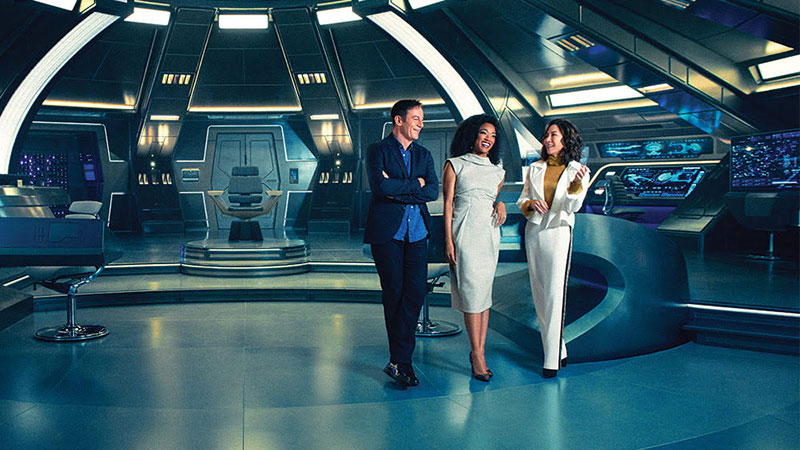
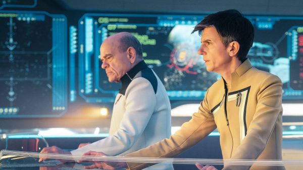
Jason Isaacs, Soniqua Martin-Green and Michelle Yeoh on the bridge of the Discovery
Matt Morgan then proceeded to show us what we’ve all been waiting for, unseen photos of the Discovery bridge.
We have four of these consoles on set [refereeing to a group of multiple computer consoles] The top monitor is an 85″ wide screen, there’s a 65″ [lower monitor] wide screen and then a clear 55″ OLED display, which Tim will get to about the graphics shortly. They are all practical screens, it’s all live playback.
And one of my favorite shots, this wall has over 500 LED’s that were all hand wired.
Morgan was referring to the wall of purple colored LEDs at the rear of the USS Discovery bridge behind Captain Lorca. We were shown what is on the other side of that LED wall and it was a massive array of LEDs with countless wires and ballasts.
Next up Tim Peel Lead Graphics Designer discussed his responsibility for all the display graphics for the Federation and Klingon ships.
I want to take you through a quick little tour of the motion graphics that we have running on the show. I’ve just done my best to pretty much give you something that’s better than your cell phone so you can believe you’re really in the 23rd century.
Tim shows as an image of the Enterprise NX-01 graphic showing an overhead ship schematic.
Chronologically in the Star Trek canon there’s the Enterprise (NX-01) so this is a look at Michael Okuda’s beautiful stuff, he’s my God. Mike and Denise, they’re just such a team.
The fictional plans are worked out so you can basically position yourself in a ship. You want to feel that your computers will show you where you are inside a Federation ship. This is a classic one on the original series [shows classic Enterprise side view cross section] it’s about as close to a motion graphics as they got, which is a back lit panel. (Tim then shows different era screen panels from the TOS movies) And then you move further down the canon and finally ending up in the next generation (shows cross section side view 1701-D LCARS) so this is sort of the history of the LCARS Library access computer system from before I got involved.
We’re trying to build a few key differences or at least advantages now that we have in the way we make motion graphics. Ones we can animate and we can make them touch interactive and have access to 3D models. So I can keep the looks the same but the tech is way more advanced than it used to be so I try to honor the look and the feel but the tech is a little better.
Tim shows us an animated image of the helm of the Discovery. It looks very much like Kelvin universe graphics but not as predominantly blue, more gray, with some white and red colors as well. It is beautifully animated and fairly straightforward. He selects impulse, the digital dials move and the impulse engines on the ship graphic light up red and have a light stream emanating from them.
Here is the user interface for the helmsman of the Discovery and here it is animated. So we have on the left the warp control and on the right, you have the impulse control. I don’t have the hand motions so I wasn’t able to show that but sort of shows how I can highlight a certain part of that, on the right we can select a certain speed, then engage, the engines fire up and off we go. So it has a nice semi practical feel which we didn’t always do on star trek before.
This is an engineering diagram of nacelles functioning, a cross-section through engineering.
The animated engineering graphic that Tim showed for the nacelles functioning was slightly akin to what we’ve seen Robert Downey Jr. as Tony Stark uses in the Iron Man movies where the nacelle diagram can disassemble it into parts and there are circles highlighting/identifying different areas of the nacelles.
This is one of the transparent screens of action on the Discovery bridge. So you really have a lot of varying levels you can see we’ve got all kinds of levels of transparency going all the way back, there are almost 20 screens (layers). All of this is playing practical, there are almost very few visual effects [done in post] except for the giant view screen.
Peel continued to show different images of graphic layouts for the computer screens. In one image the ship was on red alert and I noticed a familiar logo in the top right corner of the screen, the red alert logo designed for Star Trek The Motion Picture.
The Shenzhou has a slightly blue-y (graphics display) kind of restricting all the color schemes and we will slowly advance and become more colorful as we get closer towards the original series and for other reasons I can’t mention.
I always wanted to give McCoy better tools. So here we have sort of genetic recombination, typical body scans, a lot of Klingon physiology, alien physiology, this is a human one, I can’t show the alien physiology yet, I’m sure you guys can look for it in the series. I hopefully got the organs in the right place. I’ve also shown the advancements in 3D modeling and 3D animation and really show the entire neurology of the brain, the function of the and the image of conscienceless or at least the format. It just fun, I gotta say I can’t have more fun at job.
Here we are in the turbo lift, this is when we were still doing lettered decks, this is just an early test inside (shows animated graphics on screen in turbo lift set) we really did work out the deck plans, we sliced through the 3D model thinking of all the possible levels and sort want to give you a sense of turbo lifting through the ship. And just try to sync all these screens up so it really gives you a feel of traveling, it also has a bit of a connection to the other series.
During some random photos, Tim Peel was showing there was a vector graphic image showing a cross-section of the underside up the ship looking up and showed the engineering section. There were two rooms labeled ‘Port Engineering Room” and “Starboard Engineering Room.” Located in front of those two room closer towards the deflector dish there was a vertical warp core. Now, these were not actual set photos so it’s possible that it is not the final design.
Here we are in the transporter room, and these are all interactive, these sliders actually work. You know, I watched O’Brien many times.
The Klingons, this is a lot of fun, so we know the Klingons are more advanced than us and the Klingons have always had very clunky looking interfaces there fun and very geometrical and always orange and red. And so I wanted to use on the sarcophagus ship, doesn’t really have places where we can put screens as much as we could put holograms. So it became more fun to design this holographic interface, to really take on the federation.
Some of the props, very classic old style tricorder except we shoved a screen in it.
We go into some really tight detail. The pixies break up here but you really have a great deal of functionality on all the props, it’s just a tremendous amount of fun to do.
Finally, we had Andy Sang – Graphics Designer speak about the visualization of the Klingon language. Unfortunately, he was cut short just as he was getting into Federation and Starfleet graphics. He did manage to flip through some photos very fast which showed some Starfleet logos and alcohol bottle labels.
I’m going to start with the Klingon language, it’s such an important language to everybody, it’s a full language, everyone speaks it, I want to respect it so we wanted to start at the beginning with the Klingon language. I went back with Mark Worthington and Todd (Cherniawsky) we wanted to design something that looked like it actually came from history so we did some research on other languages and how they were all written throughout history. We started with calligraphy thinking we’ll try some of that style and different ways of doing different letters. And then this is what we ended up with.
(Shows lines of various style of Klingon text. One line was the common style we have seen throughout the TNG era. There was another style which was in the Discover cryptic promo.)
We worked with Robin Steuart to do all the translations and all the Klingon writing, she vetted all these things, made sure all the lines were the right length.
Andy shows an image of Klingon text on various sub straights like stone, metal, wood and how Klingon writing would look on them.
Sang: This is how it’s implemented on different surfaces. And then on the podium, we had the final reflection (The stone slab under the sarcophagus) that Matt was talking about.
At this point, the presentation was cut short as the panel had run out of time. Andy Sang managed to quickly flip through about a dozen more photos without describing them before the Fan Expo staff asked everyone to vacate the room. In those images were some Starfleet Command logos, a redesigned 3D chess board, and some bottles of alien alcohol to show off the labels.
This panel was incredibly fascinating, enlightening, revealing and satisfying, well worth standing in line for an hour and a half. I learned more about the process of production for a show of this size and needless to say it is an impressive undertaking. As a Trekkie it was thrilling to see new photos, sketches, and designs not yet seen before. The people behind this show are brilliant, creative, passionate minds beholden to the legacy of Star Trek. Whatever your level of interest for this show be it beyond excited like myself or a bit skeptical, I can say without question we are in for a treat. This show will boldly go where Star Trek has never gone before.
Star Trek: Discovery is set to premiere on Sunday, September 24 at 8:30 PM ET on CBS. Immediately following the first episode’s release, the second episode will be available in the U.S. on CBS All Access, with subsequent episodes released on Sundays. The first eight episodes will run from September 24 through November 5, with the series returning in January 2018.
TrekNews.net is your dedicated source for all the latest news on Star Trek: Discovery. Follow @TrekNewsnet on Twitter, TrekNews on Facebook, @TrekNews on Instagram and TrekNewsnet on YouTube.
Report by Chadwick Adams for TrekNews.net.
[amazon_link asins=’1785651161,B01NAJ4HMI,B01N47VPJG,B01BP06ENA’ template=’ProductGrid’ store=’treknenet-20′ marketplace=’US’ link_id=’4b1179cc-7571-11e7-82e5-63a7a90ab97c’]


















![2023: A banner year for Star Trek — here’s why [Op-Ed]](https://treknews.net/wp-content/uploads/2024/01/star-trek-2023-year-in-review-600x337.jpg)






![[REPORT] 'Star Trek: Discovery' Production Details Emerge at Fan Expo Canada](https://treknews.net/wp-content/uploads/2017/09/star-trek-discovery-fan-expo-canada-production.jpg)


Marian Ciobanu
September 10, 2017 at 9:45 am
-On the IMDB page of the series ,the new look of the Klingons and the new insignia are considered goofs.It would be nice to have an explanation from the producers about this.
Tuskin38
September 10, 2017 at 6:54 pm
Because it isn’t the 1960s anymore.
And anyone can edit IMDb.
They’re probably disgruntled fans.
John Capes
September 10, 2017 at 12:20 pm
As much trouble as the panel went to for over-explaining their loyalty to Roddenberry’s vision, and their love for the classic aspects of Trek indicates to me one more time that they are back on their heels before the series gets out of the gate. There was too much focus on the “virtue” casting of the characters and not enough on what makes Trek….Trek. I still hope that they pull it off and make this fly. I really do. But thus far it feels like too much detail has gone into the wrong things.
Ex:
1.The sets…Trek was simple back in the day and this series is set 10 years prior? So….seriously? Why not put it out 50 years after TNG instead? It’s too late now of course but that one point has many people shaking their heads. It’s way over done in this area. I suppose that was potentially to offset if the story wasn’t particularly good.
2.The Sexual Orientation of the crew….Really? Why should that factor in as an element at all? Roddenberry addressed this as fact already 50 years ago so focus on the deeper character dynamics instead. Why are these people here? Why did they choose Starfleet? Make us want to know them for deeper reasons and get us interested in the storyline instead of “this is the most diverse Star Trek series ever. Blah Blah Blah”. Stop projecting virtue casting so hard and focus on the plot and the story of “why” we are back in the 23rd century again as opposed to late 24th or even 25 century?
3.I realize that this seems to be taboo for some reason but try “listening” to the classic fans and what some of their concerns are instead of appearing to be overly dismissive? There is a heightened sense of arrogance coming from some of this cast and series developers (again in my opinion) that since IS such a diverse cast, if it fails……it will be because of the ignorance of some of those same lifelong fans.
Bottom line, they have front loaded identity politics and brand new mostly out of sync set designs and combined it with a race that are called Klingons that no one recognizes as such and effectively neutralized the energy and excitement from a rather large fan base. I’m just a big nerd at heart so I’d like to see this work. But so far the only thing I have liked is the retro phaser design. Good luck.
Tuskin38
September 10, 2017 at 6:54 pm
It isn’t the 1960s.
You answer for everything.
John Capes
September 23, 2017 at 3:07 pm
Care to elaborate?
Roy Ben-Ami
September 22, 2017 at 8:54 pm
Agreed. The Klingon redesign is what kills it for me – they lost me as a fan and as a die hard Trekkie.
John Capes
September 23, 2017 at 3:11 pm
I want it to work. But they have chosen too many of the wrong targets in my opinion. It’s one thing to work in allegory, but it’s something totally different to front social justice and virtue casting as one of the primary thrusts of the show. Good writing and character development is what the focus needs to be.