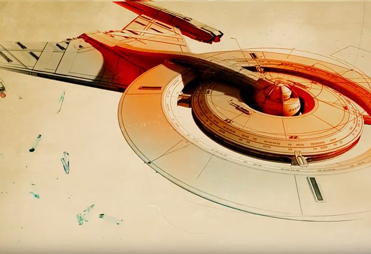
Star Trek: Discovery‘s opening credits are a vast departure from those of any Star Trek series to come before it. The detailed blueprint drawings that rotate, spin and expand against a sepia toned texture, set against Jeff Russo’s score, have earned the sequence an Emmy nomination for Outstanding Main Title Design.
Ana Criado, the creative director at the L.A.-based agency Prologue, recently discussed how she and her team brought the 90-second sequence to life, in an interview on IndieWire.
“It didn’t seem like a huge challenge until I started to know more about ‘Star Trek’ and then I said, ‘OK, this isn’t gonna be easy.’ We were lucky that we found this idea of blueprints and it fit in perfectly with the concept of the TV show. It’s a prequel, so it leaves its own space to create and to present the elements that everybody knows,” Criado said.
She went on to talk about how the project evolved over time and the factors that led to the sepia tones it’s come to be recognized for.
“At the beginning, we started to work with black and white. But the black and white by itself looks very cold,” Criado said. “We are relating to the Renaissance. I wanted to make it look like we are designing everything from scratch. I wanted the white, sepia color in the background. I didn’t want to put too much color, but I didn’t want to leave it just black or grey.”
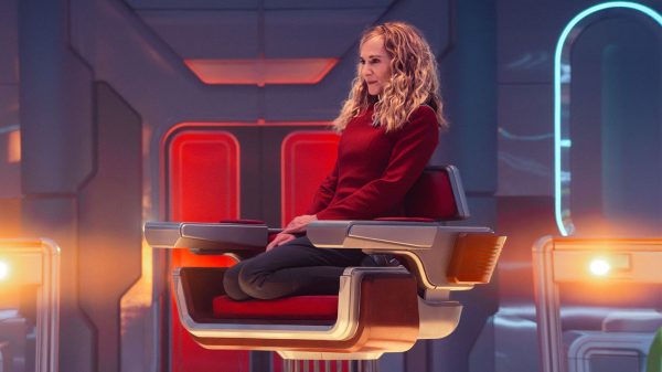
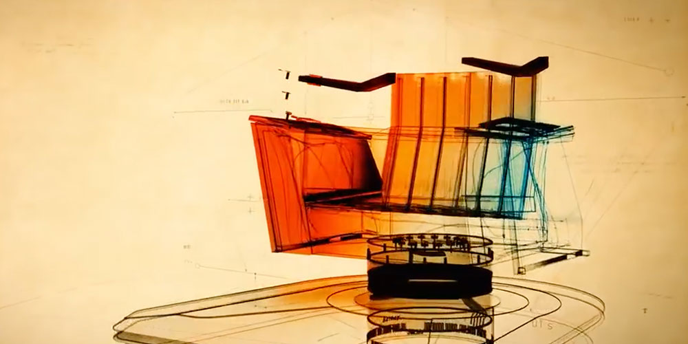
For Discovery‘s second season, Criado and her team were tasked with updating the sequence to include other iconic elements that would play heavily into the narrative of that season. One of those being the captain’s chair.
“It was one of the most important pieces that they wanted to show. It was iconic for the fans, because it’s related to a new captain,” Criado said. “We needed to take into account which pieces we were removing and gonna be replaced. We tried different representations, but the one that we chose — with the balance of the transparent, X-ray parts of the chair and the solid parts — they fit together perfectly. We did put some easter eggs for the fans in that part, if they want to look closely.”
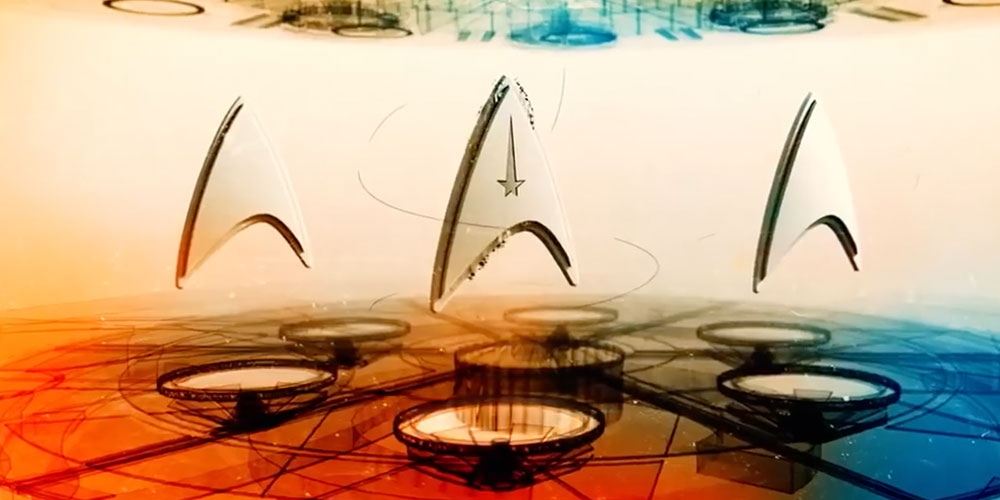
Another update to the opening included the addition of three Starfleet insignias.
“For me, that specific moment was the most difficult one to fit in the sequence. That image is very crowded, because you have the room and the three symbols. We decided to not make them appear at the same time, which would make it more distracting,” Criado said. “I think it finally worked, but it was a bit of a nightmare for us to try to fit them perfectly and not make it distracting. It still shows the three badges, which was the most important thing for us.”
Discovery isn’t the only Star Trek property Criado and her team are working on. In addition to the third season of Discovery, they’ve also been tasked with creating an opening for Star Trek: Picard, when it premieres early next year.
“It’s very exciting and we are so happy to keep going with this amazing team and CBS. They are very collaborative and it’s always a pleasure to work with them, honestly,” Criado said.
You can check out the first and second season opening title sequences for Star Trek: Discovery below.
Star Trek: Discovery – Season 1 Main Title Sequence
Star Trek: Discovery – Season 2 Main Title Sequence
Stay tuned to TrekNews.net for all the latest news on Star Trek: Discovery, Star Trek: Picard, Star Trek: Lower Decks and Star Trek: Short Treks. Connect with us at @TrekNewsNet on Twitter, @TrekNews on Facebook, and @TrekNews on Instagram.




















DataMeister1
August 29, 2019 at 12:30 am
I can’t imagine who would have nominated this.
People have drastically different tastes I guess, but I thought the title sequence was among the worst of modern TV shows. Not just the worst of the Star Trek shows, but of all shows across the board. It is boring and the music is borderline depressing. It may have good technical design, but creatively it is lacking for me.
It kind of gives an impression of a tired and run down show instead of something exciting. That’s not something I was expecting from a new Star Trek series.
Wayne Hutton
August 29, 2019 at 6:10 pm
I couldn’t disagree more I’ve never really been a trekkie, but I can honestly hands down say I was hooked on season 1&2 and will definitely be looking forward to anymore discoveries that may follow.
DataMeister1
August 29, 2019 at 6:19 pm
What about the title sequences did you like so much?